Norwich Lettering

Here you will find examples of lettering that I have photographed on the streets of Norwich. I have added a commentary that relates these images to typographic practice and history. I hope you find this interesting and also that it might provoke you into discovering more about type and letterforms through study (and through keeping your eyes open). PS: The main dates shown are original postings. Each time I add a new image the date is inserted thus (07.09.06).

Name:

I have been a graphic designer for over thirty years and an artist for even longer. I led the BA (Hons) Graphic Design courses at Norwich University of the Arts and the University of Hertfordshire between 1992 and 2011. My abiding interest is in type and lettering, with a particular interest in vernacular letterforms. I am the image moderator for, and the major contributor to The Visual Dictionary: www.thevisualdictionary.net

Thursday, January 04, 2007

Jarrolds department store


Jarrolds is a major Norwich landmark, standing at the corner of the Market Square. The building is covered with decoration and a lot of lettering. There are many iterations of the Jarrolds logo (in recent years using Bembo caps) in a range of media. The name above the corner entrance is in a Victorian serif, with hesitant, not to say submissive, legs on the Rs.


This version, using a version of Bembo with attenuated legs on the Rs (an alternative form of the R that is sometimes used in text to improve letterspacing) could date from the 1950s.


Above is the current version of the logo, which is used throughout the store as their identity. Using the full, elegant R with the very long, space-problem-causing leg, it looks okay but the letterspacing could do with a tweak (especially the OL; the JA could do with a rethink as well).


Two further iterations of the current logo, both in raised cutout metal letters. The one on the right still needs a space adjustment, but the one on the left has been improved by a signfitter with a good eye for spacing.


Here we have an outline version: less elegant, I think. The added outline makes this classic Garalde (old face) font appear to be a robust slab serif at first glance. I've only just noticed that they used to be Jarrolds, but now they are Jarrold. It doesn't stop us all still calling it Jarrolds, though. Recognition points for these letters in Bembo: long leg on the R; flat top on the apex of the A, with a hint of a serif; long, narrow J with a significant descender depth.


Another showing for the original lettering, this one is on the Exchange Street facade. (19.01.07)

Below is a series of names that decorate the upper walls of the storefront. I have tried to find out who they represent, but beyond discovering that Jokai was a famous Hungarian author in the late 19th century; Spilling wrote semi-religious novels in the same period and Farnell wrote tracts on ancient Greek religion I have drawn a blank. I guess all the others were authors too, but their fame is now dimmed by the passage of time. You will need to crane your neck to look at these.

Saturday, November 11, 2006

Letterspacing


When using all capitals in a piece of headline typography, you have to take care to create even spacing. As an example I have picked the word TRAVEL, as it has a series of difficult letter pairings to cope with, exaggerated by my choice of the Bembo font, which has a long leg on the R (Jarrolds use this typeface for their store's identity). Image 1 is how the computer sets the word, unaltered, with 0 tracking (spacing between letters). Image 2 highlights the disparate size of the spaces between letters. In Image 3 I have altered each individual space to match the largest one (between the R and the A). Image 4 highlights the equalised spaces. In Image 5 I have altered each individual space to match the smallest one (between the A and the V). Image 6 highlights the size of the spaces.


The next photographic image shows some eccentric letterspacing to be found on Tombland, opposite the Erpingham gate of the Cathedral. Is it Tom Bland? Could be. I will feature other examples whenever they turn up.

Tuesday, August 15, 2006

London Street etc.

Near the top of London Street you will find the Bowhill & Elliott shoe shop. They are the last shoe manufacturers in Norwich, still making slippers in their downstairs workshop. The lettering is a classic 1920s modernist sans serif, similar to Gill Sans Bold, elegantly letterspaced. This could have been in place since the 1930s, but similar letterforms were in wide use until the early 1960s, when they fell out of favour for a couple of decades. Note the restrained and undersized ampersand. This lettering (and its spacing) implies quality with a slight sense of reserve.

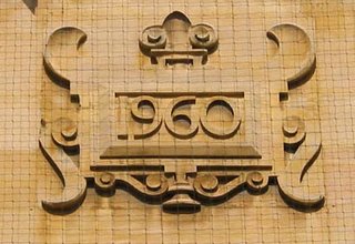
Further down London Street on the same side as Bowhill & Elliott you will find a tall sandstone building (the Woolwich) with three date plaques carved high up on its facia. These presumably represent the dates of the original build (1844), the first remodelling (1900) and the most recent facelift (1960). My guess is that the two earlier dates were both carved in 1900 to commemorate the new look of the building (the detailing of the cartouche is very similar on both) and that the third was added in 1960 (the details are different: a slightly more robust numeral; a plinth ornament at bottom centre instead of a bifurcated one; a more generous fleur-de-lys on top with downturned outer leaves; upswept instead of downswept horns on top of the cartouche). Very nice work, whenever it was done.

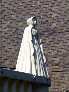
On the opposite side of London Street, Opie Street slopes up towards Castle Meadow. Opie Street was named after Mrs. Amelia Opie (1769-1853), who was a prominent Norwich socialite and author, friend of Mary Wollstonecraft, who later became a Quaker and was a major social reformer and worker for charity in the early 19th century. Her statue sits rather uncomfortably on top of a shopfront on the right of the street. Of course, the street may well have been named after her husband, the painter John Opie (1761-1807) but I am sticking with Amelia.

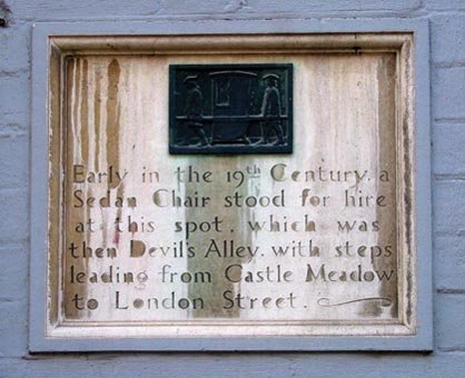
When you enter Opie Street, immediately on the right there is a carved limestone tablet recording the sedan chair service that used to operate from the spot. Nice to know that the street used to be called 'Devil's Alley'. Did this have satanic connotations or did it refer to 'Printer's Devils'? The lettering is nicely carved but with some erratic letterspacing caused by the generous width of the 't'. The sloping crossbar on the lowercase 'e' (a humanist typographical feature from the mid-15th century) indicates that this may have been inscribed around 1920, when such typefaces were being revived, notably Centaur by Bruce Rogers. Some other typefaces that feature this are Italian Old Style, Clearface and William Morris's Golden Type.

At the top of Opie Street, on the left, there is a spectacular piece of opulently carved Victoriana above and around the door to Castle Chambers. Wonderfully sculpted tiles over the nameplate feature a central panel with '1877' in intertwining and rather gothic numerals (the flat-topped 8 is often found in work from this period). The 'Castle Chambers' letterforms themselves are powerful in intent and relatively consistent, although they feel rather lumpy, especially in the curved letters (C and S). As with the Art School facia, this suffers from over-tight letterspacing, which has forced the signmaker to use an uncomfortably compressed M.

Further down London Street, on the right, there is the fine shopfront of Winsor Bishop, goldsmiths. (07.09.06) This window looks like a jewel box, due to the style and impact of the ornate and gilded letterforms, beautifully incised and protected behind glass. Below is a close-up of the paired numeral panel.


These numerals and the 'Winsor Bishop' lettering are standard 19th century slab serif letterforms, also known as 'Egyptians', due to the concurrent popularity of Egyptology at the time that they first appeared. The 'Watchmaker' form is quite different; a more decorative and spindly letter, especially in the looped centre strokes of the W and M. Looks to have been made in the late 19th century.


(30.09.06) On the left of London Street, opposite Swan Lane, is Gap. The sign in the window features their logo, which is a condensed 'Modern' or Didone face. These typefaces are distinguished by their strong contrast in stroke weight: thick thick strokes and thin thin strokes, similar to Bodoni and Didot, faces designed in Italy and France at the end of the 18th century. They are often used by the fashion industry (e.g. the ELLE masthead) as they have an elegant air, especially when condensed to this extent. This looks to have been specially designed by a logo specialist rather than use an off-the-peg typeface.

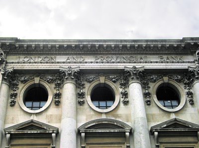
Look up to the top of the building and you will see its more floridly classical origin in the late Victorian era as the London and Provincial Bank. Not too badly spaced, but inconsistent design of the A (differing crossbar heights).

Across London Street is Habitat. Just in case you miss it, the name is repeated at least four times, at different heights and sizes, all over the unlovely building.
Luckily, the Habitat logo uses a particularly lovely typeface: Baskerville Old Face, sometimes called Fry's Baskerville. It was designed in the late 18th. century, inspired by John Baskerville's original of c. 1755. I have always thought that this was a good choice for the Habitat logo, as it is an English design classic and a further refined version of another design classic, all of which ties in neatly with the company's original aims. Using all lower case letters gives the name a conversational air and looks quite approachable. I quite like the metal version, with the i dot on a stick, completely undermining the refinement of the letterform but managing by default to look rather postmodern.

Monday, August 14, 2006

St. George's Street etc.

Posted here are examples of lettering that you can see in the streets around the City, starting with the Art School itself. Carved in stone, in a robust Victorian serif letterform, the Norwich Technical Institute proudly displays its intentions to educate our youth in practical skills. Unfortunately they used poor, cramped letterspacing and three very small Cs. Notice how they float above the baseline and don't appear to reach the full cap height.

A nicely-sculpted terracotta plaque near St. Andrew's Hall. The inscription tells us that it was created in 1902 (MDCCCCII: a bit of a long-winded system, Roman numerals) and 'Floreat Norvicum' probably means 'Flourish Norwich', which is an odd thing to put on the wall of what once was a public lavatory. This plaque can be found facing Delaney's pub, next to Princes Street.
Round the corner, as you walk up Princes Street, there is an old lamp, styled after a gas lamp, on the wall to your right, bearing the numbers '2072' in stencil lettering. Unless it has been beamed in from the future, this is unlikely to be a date and is possibly an identification mark for locating individual lamps when maintenance is required. Lettering looks a lot newer than the lamp.

Almost opposite the lamp, on the corner of the first building you come to on the left, are two small plaques. They appear to be made out of lead and bear the marks 'XSA 1813' and 'XSA 1832'. I think these are identification plaques for the nineteenth-century private fire brigades: you needed one of these plaques to show that you had paid your insurance. If your house was on fire and the engine arrived to find no up-to-date plaque, then they drove away and let it burn. The 1832 example has well-modelled letters and numerals, save for the spindly 8, but the 1813 model looks almost mediaeval by comparison (except for the rather elegant serif on the top left of the X, which has a look of Palatino [but 150 years earlier]). This kind of lettering is very common in the 19th century: it contains elements of the 'Modern' style (eg Bodoni) but has degenerated a long way in the hands of a local signmaker. At right angles to these two plaques, just round the corner of the same building, are a further two: 'HSP 1814' and 'HSP 1834'. Somebody was well insured. (07.09.06)


Across St. Andrew's Street, on the face of Cinema City, there is an oval stone plaque commemorating the residents of Sucklings House from 1285 to 1564. I can't date the lettering but it is a beautifully carved roman with hints of script in the curved lowercase 'l' and 'f'. It has a very tall x-height and a strange but characterful lowercase 'g', which makes me think that this was carved in the early 20th century (but I could be hugely wrong on this one).


(29.08.06) Delaney's pub, on the corner of St. George's Street and St. Andrew's Street, uses a modern version of an ancient lettering style, the uncial. This was prevalent in Ireland in the middle ages and is too often used as a shorthand for 'Irishness'. The name uncial relates to the gaelic word 'unce', meaning inch, which was the height at which this kind of lettering was originally drawn.


(29.08.06) Saint Andrew's Hall. This rather temporary-looking sign on such a beautiful and historically significant building is a shame. The lettering is a functional Victorian slab-serif typeface akin to ITC Bookman demi-bold, redesigned in 1975 by Ed Benguiat. Something more sympathetic (in choice of signboard colour, too) would make a great improvement.


(29.08.06) Expresso General Store: a fine establishment. They have used a modernist classic typeface (Futura, designed by Paul Renner in 1927) for their name, but then used another modernist classic (Gill Sans Bold, Eric Gill 1928) for the rest of the information. This goes against one of the first rules-of-thumb in typography: when using two typefaces, make one of them a serif and the other a sans, or you blur your message.