
Letterspacing

When using all capitals in a piece of headline typography, you have to take care to create even spacing. As an example I have picked the word TRAVEL, as it has a series of difficult letter pairings to cope with, exaggerated by my choice of the Bembo font, which has a long leg on the R (Jarrolds use this typeface for their store's identity). Image 1 is how the computer sets the word, unaltered, with 0 tracking (spacing between letters). Image 2 highlights the disparate size of the spaces between letters. In Image 3 I have altered each individual space to match the largest one (between the R and the A). Image 4 highlights the equalised spaces. In Image 5 I have altered each individual space to match the smallest one (between the A and the V). Image 6 highlights the size of the spaces.


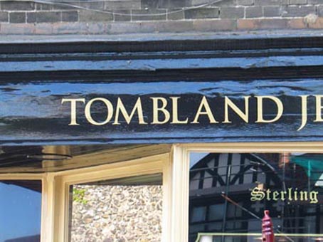
The next photographic image shows some eccentric letterspacing to be found on Tombland, opposite the Erpingham gate of the Cathedral. Is it Tom Bland? Could be. I will feature other examples whenever they turn up.
posted by phil gray | 2:58 AM
![]()
0 Comments:
Post a Comment
<< Home