
St. George's Street etc.
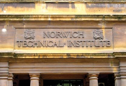 Posted here are examples of lettering that you can see in the streets around the City, starting with the Art School itself. Carved in stone, in a robust Victorian serif letterform, the Norwich Technical Institute proudly displays its intentions to educate our youth in practical skills. Unfortunately they used poor, cramped letterspacing and three very small Cs. Notice how they float above the baseline and don't appear to reach the full cap height.
 A nicely-sculpted terracotta plaque near St. Andrew's Hall. The inscription tells us that it was created in 1902 (MDCCCCII: a bit of a long-winded system, Roman numerals) and 'Floreat Norvicum' probably means 'Flourish Norwich', which is an odd thing to put on the wall of what once was a public lavatory. This plaque can be found facing Delaney's pub, next to Princes Street.
 Round the corner, as you walk up Princes Street, there is an old lamp, styled after a gas lamp, on the wall to your right, bearing the numbers '2072' in stencil lettering. Unless it has been beamed in from the future, this is unlikely to be a date and is possibly an identification mark for locating individual lamps when maintenance is required. Lettering looks a lot newer than the lamp.
 Almost opposite the lamp, on the corner of the first building you come to on the left, are two small plaques. They appear to be made out of lead and bear the marks 'XSA 1813' and 'XSA 1832'. I think these are identification plaques for the nineteenth-century private fire brigades: you needed one of these plaques to show that you had paid your insurance. If your house was on fire and the engine arrived to find no up-to-date plaque, then they drove away and let it burn.

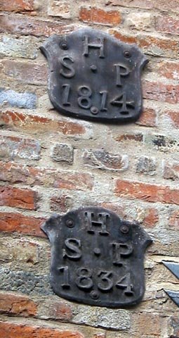 The 1832 example has well-modelled letters and numerals, save for the spindly 8, but the 1813 model looks almost mediaeval by comparison (except for the rather elegant serif on the top left of the X, which has a look of Palatino [but 150 years earlier]). This kind of lettering is very common in the 19th century: it contains elements of the 'Modern' style (eg Bodoni) but has degenerated a long way in the hands of a local signmaker. At right angles to these two plaques, just round the corner of the same building, are a further two: 'HSP 1814' and 'HSP 1834'. Somebody was well insured. (07.09.06)
Across St. Andrew's Street, on the face of Cinema City, there is an oval stone plaque commemorating the residents of Sucklings House from 1285 to 1564. I can't date the lettering but it is a beautifully carved roman with hints of script in the curved lowercase 'l' and 'f'. It has a very tall x-height and a strange but characterful lowercase 'g', which makes me think that this was carved in the early 20th century (but I could be hugely wrong on this one).

(29.08.06) Delaney's pub, on the corner of St. George's Street and St. Andrew's Street, uses a modern version of an ancient lettering style, the uncial. This was prevalent in Ireland in the middle ages and is too often used as a shorthand for 'Irishness'. The name uncial relates to the gaelic word 'unce', meaning inch, which was the height at which this kind of lettering was originally drawn.

(29.08.06) Saint Andrew's Hall. This rather temporary-looking sign on such a beautiful and historically significant building is a shame. The lettering is a functional Victorian slab-serif typeface akin to ITC Bookman demi-bold, redesigned in 1975 by Ed Benguiat. Something more sympathetic (in choice of signboard colour, too) would make a great improvement.

(29.08.06) Expresso General Store: a fine establishment. They have used a modernist classic typeface (Futura, designed by Paul Renner in 1927) for their name, but then used another modernist classic (Gill Sans Bold, Eric Gill 1928) for the rest of the information. This goes against one of the first rules-of-thumb in typography: when using two typefaces, make one of them a serif and the other a sans, or you blur your message.

posted by phil gray | 2:00 PM
![]()
0 Comments:
Post a Comment
<< Home